Introduction
I’m always surprised when I learn that clients do not use the Woodstock graphics section to produce on-screen graphs of their solutions. Frankly, I can’t conceive of doing an analysis without monitoring standing inventory, harvest levels, operable inventory and silvicultural activity areas. If nothing else, a graph will quickly indicate if you forgot to generate a new schedule after imposing an even-flow constraint or something similar. Seeing how inventory is changing can provide insights into why harvest levels don't seem to be what you expect.
That being said, the default color choices that Remsoft provides are at best, meh. People who know me know that I despise the “mustard” color, which to me looks more like baby poop. They also know that I don’t think much of 3D charts (which are hard to interpret), line charts with all sorts of markers, and graphs with too many outputs graphed simultaneously. There are good resources on how to display data, but Woodstock doesn’t enforce any of these rules. It is up to you to make something informative and visually pleasing.
About the Graphics Colors
Unfortunately, you cannot redefine Woodstock’s standard color codes to more pleasing shades. These are, RED, GREEN, BLUE, YELLOW, CYAN, MAGENTA, SCARLET, EMERALD, NAVY, MUSTARD, PEACH, ORANGE, BROWN, PURPLE, GREY, and BLACK. However, you can tell Woodstock that you want to use a custom color instead of one of the standard colors.
Right-click the graph and bring up the Properties dialog. Select the output you want to change and click the More (…) button. You can choose one of the standard Windows colors, or you can define your own by clicking in the rainbow box, or by specifying HSL percentages (hue, saturation, luminence) or RGB decimal values.
Once you’ve selected and saved your custom color, Woodstock will save your choice in the Graphics section using the _RGB() function, which uses decimal numbers instead of hex.
*LINESOICE 1 1000 _RGB(203,24,29) _SOLID "Cedar "OIPW 1 1000 _RGB(107,174,214) _SOLID "Ponderosa & white pines"OIDF 1 1000 _RGB(35,139,69) _SOLID "Douglas-fir, larch, spruce"OIWW 1 1000 _RGB(204,204,204) _SOLID "Whitewoods "OILP 1 1000 _RGB(33,113,181) _SOLID "Lodgepole pine"
That is all well and good, but if you save a bunch of custom colors, how do you use them in your next modeling project? You could copy and paste from your graphics section to inherit the colors, but the better approach is to edit the Woodstock palette.ini file and save them.
The WKPalette.ini File
In your Remsoft installation folder (e.g., C:\Remsoft\Ver2023.02.01), you will find a text file called wkpalette.ini. It is just a text file with a bunch of colors defined by hexadecimal RGB values. For example, #000000 is the RGB code for black, where red = 00, green = 00 and blue = 00. White would be #FFFFFF, with all three colors set to the maximum 255 (FF in hex). All other colors are some combination of RGB values ranging from black (00) to white (FF). Greys are easy because they are all the same value for red, green and blue (i.e., #969696 is a mid grey).
If you have decided on colors previously, you can save them as a new palette in the wkpalette.ini. First, save the old file as wkpalette.old, just in case you muck things up. Then open the file in any text editor (Notepad, Woodstock)
[Palette:_Default]#000000#808080#FF8000#804000#0000FF#000080#FFFF00#C2C200#8000FF#800080#C20000#008000#21A161#FF80C2#FFC0803FF0000
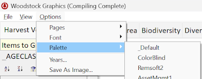
There are multiple palettes defined in the file, which can be selected from the Options menu of the Graphics window.
The best source I know of for choosing pleasing but contrasting color combination in your maps is the ColorBrewer 2.0 website. Designed for GIS professionals, it has numerous options for displaying different kinds of data on choropleth maps. But the same concepts also apply to graphs.
For a project I am currently working on, one of the team members is red-green color blind. After researching some websites on the subject, I selected a color palette that should allow anyone to discern differences in the data.
[Palette: ColorBlind]#000000#E69F00#648FFF#009E73#F0E442#0072B2#D55E00#CC79A7#332288#117733#44AA99#88CCEE#DDCC77#CC6677#AA4499#882255
Results
The colors in the new palette (right) are softer than the Remsoft defaults (left):
Summary
In addition to colors, you can also choose different fonts. The standard Tahoma fonts look good, but for those who like a fixed pitch font, Consolas is also nice. I use it as the text font in the Woodstock editor. I believe it displays better on screen than the default Courier New. When I am teaching new analysts, it is important to be able to distinguish spaces and underscores, and that's hard to do with Courier font.
NOTE: If you change the palette file, you'll also have to change the palette setting in your Woodstock graphs if you want the graph colors to change. And remember, colors are just randomly chosen when you first define graphs. You still have to manually change them if you find the same colors repeated, etc. Have fun!


